- Study
- Slides
- Videos
7.1 Introduction
One of the more useful features of chart analysis is the presence of price patterns, which can be classified into different categories and most can have very predictive value. These patterns reveal the ongoing struggle between the forces of supply and demand, as seen in the relationship between the various support and resistance levels, and allow the chartist to gauge which side is winning. Then, it’s only a matter of understanding and interpreting the information correctly.
Price patterns are broken down into two groups—reversal and continuation patterns.
Reversal patterns usually indicate that a trend reversal is taking place. These patterns are your early warning signs if you are holding the stock and are your alerts if you are considering buying it. These patterns are also very predictable once they have formed.
Continuation patterns usually represent temporary pauses in the existing trend. Continuation patterns take less time to form than reversal patterns and usually result in resumption of the original trend.
Continuation patterns take less time to form than reversal patterns and usually result in resumption of the original trend.
Chart patterns are called ‘Patterns’ for a reason. It is because they historically have proven to be indicators and great tools as to what is about to happen in the future with a stock price and/or the market as a whole.
These distinctive ‘Patterns’ are formed by the price action of a stock, and through the years the patterns have been named, most often in relation to what they resemble when looking at them on a chart.
With just a little time, you should be able to recognize them quickly to be warned when one of your stocks is about to decline or alerted when a buying opportunity is about to happen.
7.2 Reversal Patterns- Head & Shoulder
The Head and Shoulders is one of the best known and probably the most reliable of the reversal patterns. A head and shoulders top is characterized by three prominent components:
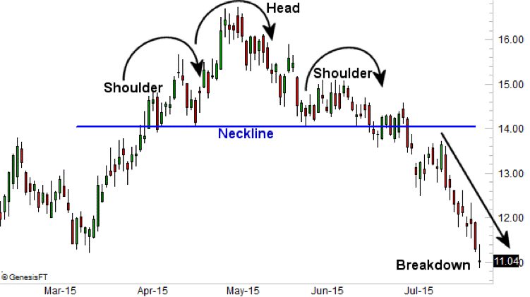
This picture is a clear representation of the three parts of this pattern–two shoulder areas and a head area that the price moves through in creating the pattern signalling a market reversal. The first “shoulder” forms after a significant bullish period in the market when the price rises and then declines into a trough. The “head” is then formed when the price increases again, creating a high peak above the level of the first shoulder formation. From this point, the price falls and creates the second shoulder, which is usually similar in appearance to the first shoulder. Importantly, the initial decline does not carry significantly below the level of the first shoulder before there is usually either a slight retracement upward or a flattening out of price movement.
The pattern is completed, giving a market reversal signal, when the price declines again, breaking below the neckline. The neckline, as depicted above, is the horizontal line that connects the first two troughs to one another.
7.3 Example of Header & Shoulder
Let’s take a look at a Head and Shoulders reversal that started a Bear Market which led to a severe market decline.
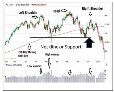
Does the above chart look familiar?
Yes, this is a chart of the Dow Jones Industrial Average during the all-time-high set in October of 2007. And as you remember – that was the beginning of a major bear market. First of all – Look at the clear Head and Shoulders Pattern. The left shoulder was the first high. Then the head is the all-time-high. Then the right shoulder is the third high, also called the third ‘Peak.
This is a classic ‘Head and Shoulders’ Pattern. When you see one of these forming whether it is on an individual stock, index fund, it is time to ‘Sit up and Pay Attention!’
This formation is one of the most reliable chart patterns you will see. Lets correlate this with Volume- The heavy volume during the pullback after the high on the left shoulder is our first clue. Look at the increased volume during that pullback. It tells us there was heavy selling, and, it tells us the volume was not confirming the uptrend that had been in place. In order for volume to confirm the uptrend, you want to see higher volume during advances and lower volume during pullbacks.
Closer Look At Volume
When looking at the volume across the bottom of the chart, as the first high formed (Left Shoulder), volume was a little higher. Normally that is good. It is nice to see a stock, or in this case the market, make a higher high on increased volume. But during the sell-off after the first high, the volume was higher than the volume of the advance while making the high.
Now notice the volume on the all-time-high (Head) is decreased volume. This is more distribution. The volume is not confirming the trend. The volume then increases on the next pullback. Inexperienced buyers are scooping up the stock and the Pros are happy to sell.
Now look at the volume on the third high (Right Shoulder). Yep, we’re in trouble now! The pullbacks and sell-offs after each high were on increased volume. Thus, more and more distribution, and more lambs being led to the slaughter.
Let’s look at support levels. Support levels are very important. We always want to know where support may be in case of a decline.
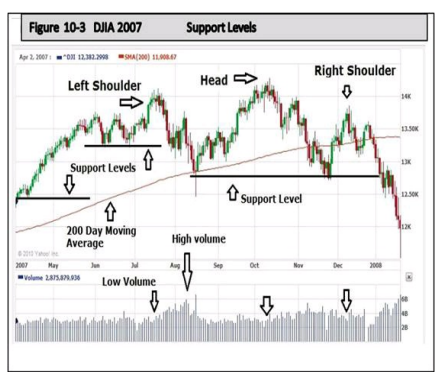
We see that there were only two support levels of any significance during this distribution phase. One was minor support just prior to the left shoulder and then there is the more significant support where the pullback landed on the 200-day moving average. The next significant support is found after the all-time high. These two significant support levels are what is considered the ‘neckline’ on this pattern.
The decline following the left shoulder top took about 30 days to find support and move higher to eventually form the highest peak, the head. That support level was tested and held prior to the right shoulder formation. But once that second support level was broken, a dramatic decline ensued. This is because the break below the neckline is confirmation of the head and shoulders pattern
7.4 Inverted Head and Shoulders Pattern
The inverted head and shoulders pattern is the mirror image of the head and shoulders.
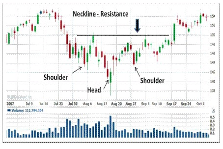
This is also a very powerful pattern that every trader and investor should easily recognize. Notice the right shoulder is not as low as the left shoulder. Again, just the reverse of the regular head and shoulders pattern where the right shoulder was not as high as the left, indicating weakness. But in this case the right shoulder is not as low as the left, and this is indicating strength.
Just as the previous pattern fell below support of the neckline, this inverted pattern breaks out above the neckline, advancing.
Now look at the lower right side of the chart at the volume. The increased volume during a breakout above prior resistance is very important. Volume confirms as it did in the break down in the earlier pattern. If a breakout above a known resistance level occurs and there is no increased volume, be very skeptical. Sometimes a false breakout occurs and the price retreats back below the resistance level. Most every time, false breakouts are on low volume
7.5 Example of Inverted Head & Shoulder Pattern
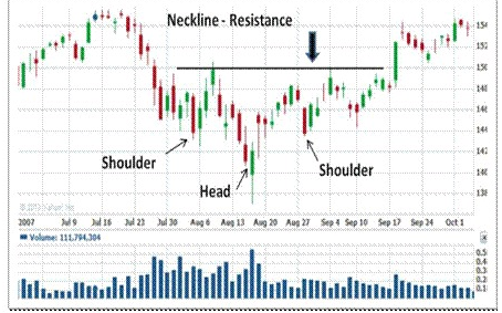
First of all, notice the long candlestick immediately after the lowest point of the right shoulder bottom. Once the stock traded down to the low of the right shoulder, it opened higher the following day and traded up to close, forming a positive candle. Three days later it hit resistance at the neckline, pulled back for four days, and then made another attempt at a breakout. It finally breaks out and closes above the resistance of the neckline. That should be a lesson to you as to the power of resistance. This stock finally broke out above it, but unless a stock has the momentum, or sufficient buying interest, always recognized as ‘volume’ on the chart, they usually cannot break out. That is why volume is so important
This is classic of a stock that had to ‘prove itself.’ Meaning, it simply had to trade above the lowest low long enough to garner the momentum to move higher. When you think about it, there were obviously enough buyers to provide support, but after it traded above support for a few days, more buyers became convinced the support was going to hold and they began buying.
Once again, this is a very accurate way to forecast what is likely to happen in the future. n this chart above, you can see how the Head and Shoulders pattern is formed by the price action of this particular stock. While it was trading continually at the resistance level, that indicated a break out was a ‘probability,’ then the close above the resistance finally confirmed it. To enter a position on this stock, a good entry point would have been after the confirmation close above the resistance level
But it is always wise to wait for the breakout, make sure there is increased volume, and then enter. That way you are entering just above known resistance, the old resistance is now support, and you can place your stop loss just below the new support level. A very low risk entry with a high potential for profit, and that is key. This type of entry is always the best. You are entering close to known support, placing a stop loss just below that support, and minimizing any loss. Your risk is low, your potential loss is minimal, and your profit, or reward, is high.
Always buy very close to support. That way your maximum loss is very small. Always use a stop loss, and let the stop loss do the work for you in case the stock turns and heads back down
7.6 Interpreting Both The Pattern
The head and shoulders pattern is favored among traders because of its unique ability to help them determine price target estimates once the pattern has completed itself and the neckline has finally been crossed. It also makes it easy for traders to place stop-loss orders. In the case of a peaking head and shoulders pattern, stops are typically placed above the top-of-the-head high price. With an inverse head and shoulders pattern, stops are usually placed below the low price formed by the head pattern.
When dealing with a traditional head and shoulders pattern, you’d be measuring the vertical distance from the top of the head down to the neckline, enabling you to determine an estimated spread amount as we just discussed. Of course, when dealing with an inverse pattern, the opposite is true. Measure the vertical distance from the top of the head up to the neckline, giving you a rough idea of how far prices are likely to move up past the neckline.

