- Study
- Slides
- Videos
4.1 Introduction
A candlestick is a way of displaying information about an asset’s price movement. Candlestick charts are one of the most popular components of technical analysis, enabling traders to interpret price information quickly and from just a few price bars.
It has three basic features:
-
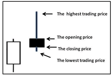
The body, which represents the open-to-close range
-
The wick, or shadow, that indicates the intra-day high and low
-
The colour, which reveals the direction of market movement – a green (or white) body indicates a price increase, while a red (or black) body shows a price decrease
Over time, individual candlesticks form patterns that traders can use to recognise major support and resistance levels. There are a great many candlestick patterns that indicate an opportunity within a market – some provide insight into the balance between buying and selling pressures, while others identify continuation patterns or market indecision.
Candlestick Chart of Nifty
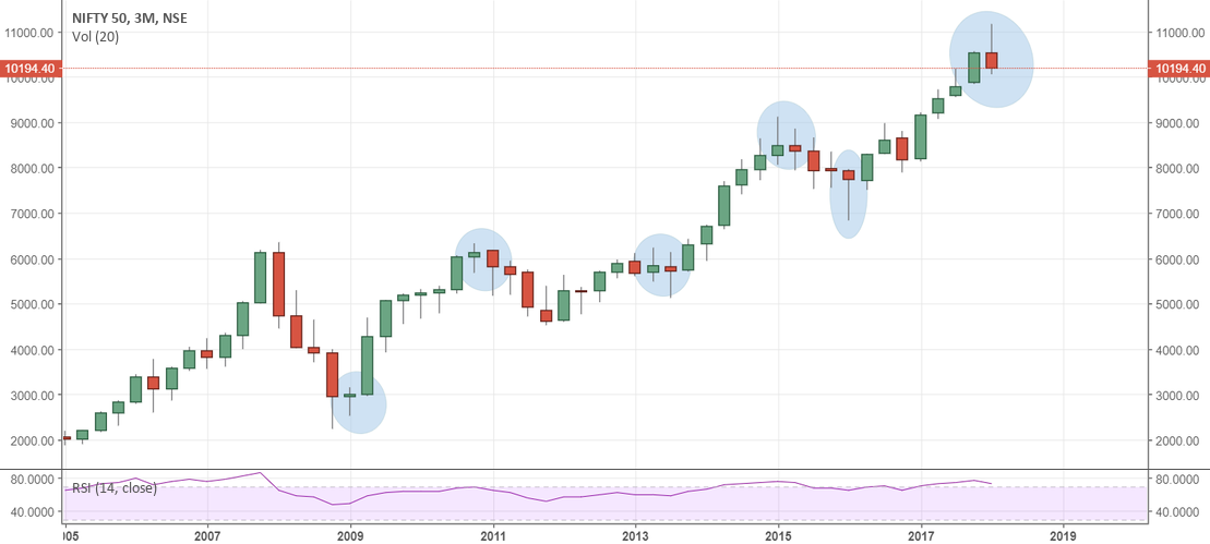
The narrow wick of each candle is the day’s trading range. The fatter portion, the body on the candle, is the area between the opening price and the closing price. Open candles are positive, meaning the stock closed at the top of the open body. This is the same as the bar chart showing the ‘Tick’ on the right side of the bar as the closing price. The darker candles are negative, meaning the stock closed at the bottom of the body. In other words, it opened higher for that day and fell to close at a lower price.
4.2 Candle Stick Basics
What does the candle Stick Look Like
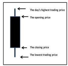
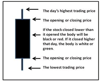 What does Red (or Black) Candlestick Mean?
The color of the candlestick tells us whether that candle was formed by a positive trading day (advance in price) or a negative day (decline in price). If the closing price is lower than the day’s opening price, then the body of the candle is red or black.
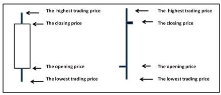
What does White Candlestick mean?
The white candle, also known as the “OPEN” Candlestick, shows the price has moved up. Candlesticks will have a body and usually two wicks on each end. The bottom of the white body represents the opening price and the top of the body represents the closing price. The top and bottom tips of each wick are the day’s highest and lowest price respectively. Thus, this candle will represent a positive “CLOSE”.
4.3 Six Bullish Candle Stick Patterns
Bullish patterns may form after a market downtrend, and signal a reversal of price movement. They are an indicator for traders to consider opening a long position to profit from any upward trajectory.
-
Hammer- The hammer candlestick pattern is formed of a short body with a long lower wick, and is found at the bottom of a downward trend.
It is normally found at the bottom and forms when a stock has been in a downtrend and finally reached a support level. The formation of the hammer occurs when a security trades significantly lower than its opening price, but rallies later in the day to close either above or very close to its opening price. This pattern forms a hammer-shaped candlestick.
It depicts that although there were selling pressures during the day, ultimately a strong buying pressure drove the price back up. The colour of the body can vary, but green hammers indicate a stronger bull market than red hammers.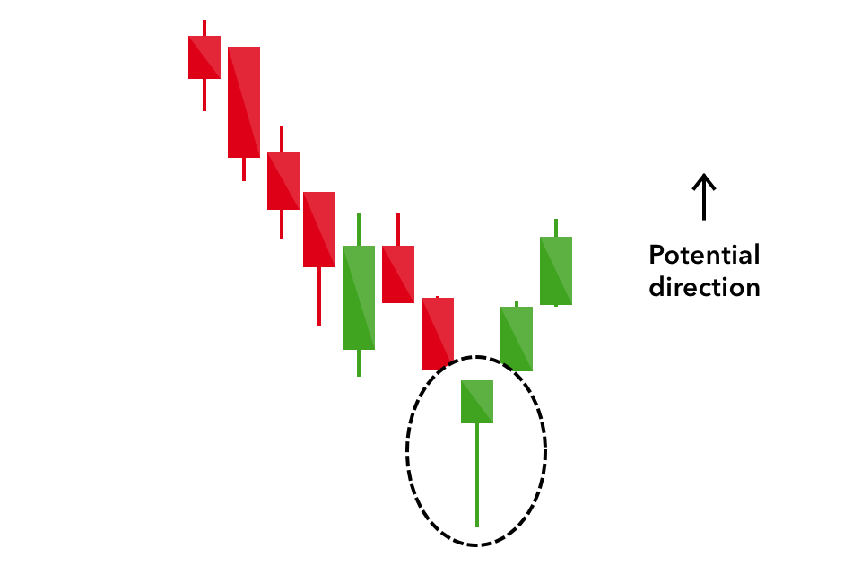
-
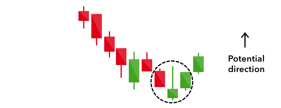
Inverse Hammer- A similarly bullish pattern is the inverted hammer. The only difference being that the upper wick is long, while the lower wick is short. It indicates a buying pressure, followed by a selling pressure that was not strong enough to drive the market price down. The inverse hammer suggests that buyers will soon have control of the market.
-
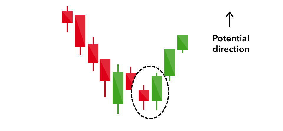
Bullish Engulfing- The bullish engulfing pattern is formed of two candlesticks. It is a chart pattern that forms when a small black candlestick is followed by a large white candlestick that completely eclipses or “engulfs” the previous day’s candlestick. The previous day’s candle can be negative or positive, it really doesn’t matter that much. What matters is the large positive candle is saying the selling may be over. When this pattern forms after a downward trend, a trader sees this as a signal that the decline is ending and a reversal is about to take place.
-
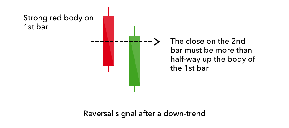
Piercing Line- The piercing line is also a two-stick pattern, made up of a long red candle, followed by a long green candle. There is usually a significant gap down between the first candlestick’s closing price, and the green candlestick’s opening. It indicates a strong buying pressure, as the price is pushed up to or above the mid-price of the previous day.
-
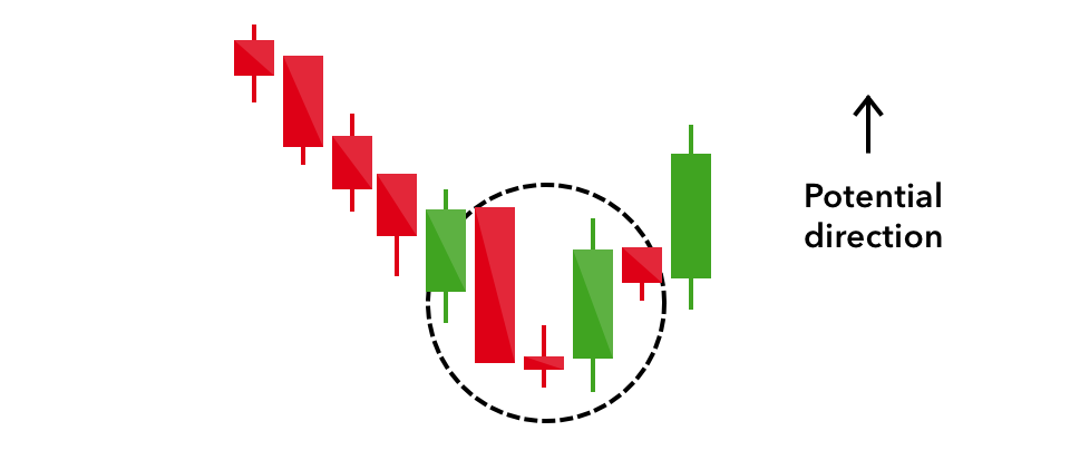
Morning Star- The morning star candlestick pattern is considered a sign of hope in a bleak market downtrend. It is a three-stick pattern: one short-bodied candle between a long red and a long green. Traditionally, the ‘star’ will have no overlap with the longer bodies, as the market gaps both on open and close. It signals that the selling pressure of the first day is subsiding, and a bull market is on the horizon.
-
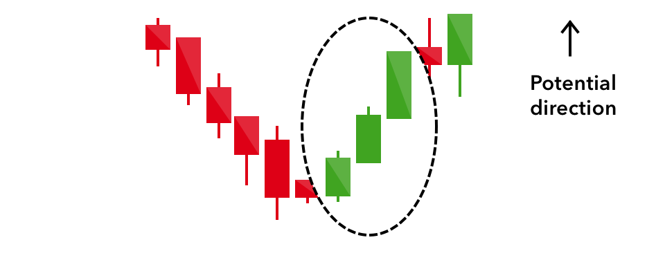
Three White Soldiers- The three white soldiers pattern occurs over three days. It consists of consecutive long green (or white) candles with small wicks, which open and close progressively higher than the previous day. It is a very strong bullish signal that occurs after a downtrend, and shows a steady advance of buying pressure.
-
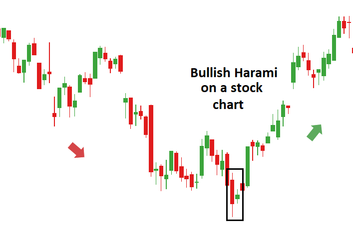
Bullish Harami – The Bullish Harami is a candlestick chart pattern in which a large candlestick is followed by a smaller candlestick whose body is located within the vertical range of the larger body candle on the previous day. In terms of candlestick colors, the bullish harami is a downtrend of negative-colored candlesticks engulfing a small positive (white) candlestick, giving a sign of a reversal of the downward trend.
4.4 Bearish Candlestick Patterns
Bearish candlestick patterns usually form after an uptrend, and signal a point of resistance. Heavy pessimism about the market price often causes traders to close their long positions, and open a short position to take advantage of the falling price.
- Hanging Man- The hanging man is the bearish equivalent of a hammer; it has the same shape but forms at the end of an uptrend. It indicates that there was a significant sell-off during the day, but that buyers were able to push the price up again. The large sell-off is often seen as an indication that the bulls are losing control of the market.
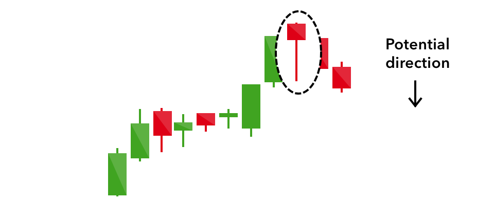
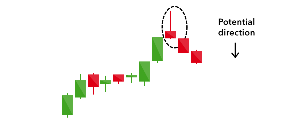
- Shooting Star- The shooting star is the same shape as the inverted hammer, but is formed in an uptrend: it has a small lower body, and a long upper wick. Try to think of it in this manner. The price has advanced for several candles, or days, and tries to continue the advance. It opens and trades higher, creating the tall wick on top of the candle, but then the sellers take over forcing the price back down to close near the opening price. This is an early indication that the advance has lost its momentum. Technically, the closing price would need to be below the opening price. However, that is not always the case. Meaning, if you simply switched the open and closing prices, it would still indicate an early warning for a reversal, maybe just not as pronounced as the close that is lower than the open. But it would still be a warning sign.
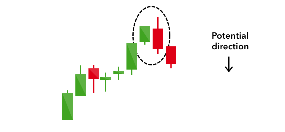
- Bearish Engulfing- A bearish engulfing pattern occurs at the end of an uptrend. The first candle has a small green body that is engulfed by a subsequent long red candle. It signifies a peak or slowdown of price movement, and is a sign of an impending market downturn. The lower the second candle goes, the more significant the trend is likely to be. Thus, it is simply the opposite of the Bullish Engulfing pattern. It forms after an advancing trend and signals that a reversal is about to take place. When you see the Bearish Engulfing pattern form after a stock has been trending up, then there is a pretty clear signal that change in direction is in the air.
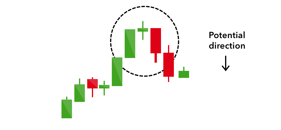
- Evening Star- The evening star is a three-candlestick pattern that is the equivalent of the bullish morning star. It is formed of a short candle sandwiched between a long green candle and a large red candlestick. It indicates the reversal of an uptrend, and is particularly strong when the third candlestick erases the gains of the first candle.
- Three Black Crows- The three black crows candlestick pattern comprises of three consecutive long red candles with short or non-existent wicks. Each session opens at a similar price to the previous day, but selling pressures push the price lower and lower with each close. Traders interpret this pattern as the start of a bearish downtrend, as the sellers have overtaken the buyers during three successive trading days.
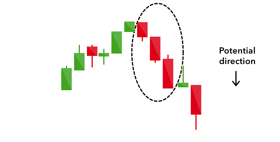
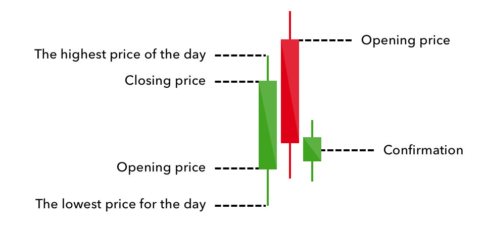
- Dark Cloud Cover- The dark cloud cover candlestick pattern indicates a bearish reversal – a black cloud over the previous day’s optimism. It comprises two candlesticks: a red candlestick which opens above the previous green body, and closes below its midpoint. It signals that the bears have taken over the session, pushing the price sharply lower. If the wicks of the candles are short it suggests that the downtrend was extremely decisive.
- The Bearish Harami- The Bearish Harami is a pattern that forms at the top after an advance. It is indicated by a large dark candlestick that forms on a negative trading day signaling a change may be in store. Then it is followed by a much smaller candlestick with a body that is located within the vertical range of the larger candle’s body.
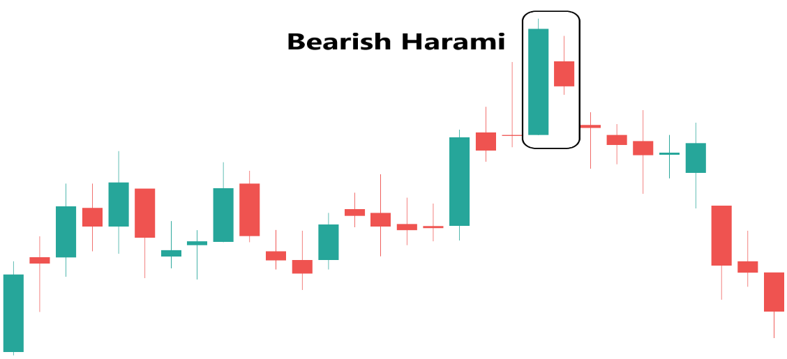
Such a pattern is an indication that the previous upward trend is coming to an end. When you think about it, the lower close of the Bearish candle is an early warning sign. When this candle forms after an advance, you know the sellers have stepped in. Even before the next candle forms you should be on high alert if you are holding this stock. Then when the next candle is formed showing the price cannot penetrate the upper area of the previous candle, this sometimes indicates a top has been reached and often times reverse in direction will soon take place
4.5 Two Continuation Candlestick Patterns
If a candlestick pattern doesn’t indicate a change in market direction, it is what is known as a continuation pattern. These can help traders to identify a period of rest in the market, when there is market indecision or neutral price movement.
1. DOJI
When a market’s open and close are almost at the same price point, the candlestick resembles a cross or plus sign – traders should look out for a short to non-existent body, with wicks of varying length. This doji’s pattern conveys a struggle between buyers and sellers that results in no net gain for either side.
When just looking at a DOJI it appears very uneventful, but when combined with other candles and trends, it can be very meaningful. When thinking in the perspective of a market trend moving higher or a downward trend moving lower, the DOJI is a very telling sign that the number of buyers and sellers has become equal. Therefore, after the market or stock has been in a trend, either up or down, and suddenly a DOJI is formed, then this tells us that since the buying and selling has equaled out – then a reversal of the current trend may be ahead.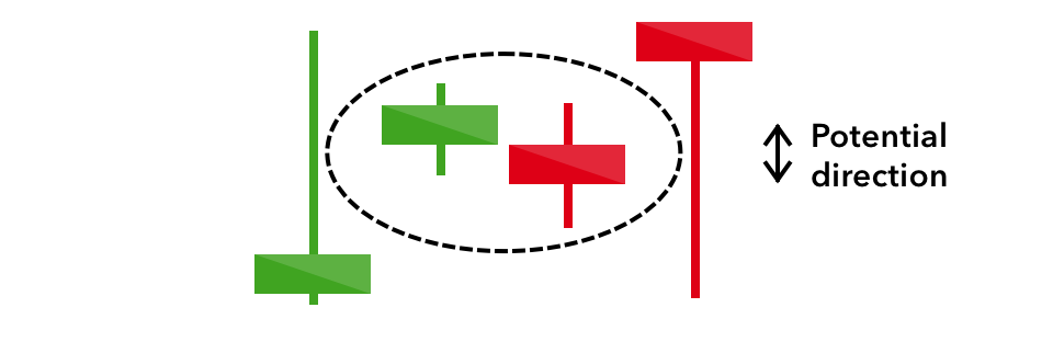
2. Spinning Top
The spinning top candlestick pattern has a short body centred between wicks of equal length. The pattern indicates indecision in the market, resulting in no meaningful change in price: the bulls sent the price higher, while the bears pushed it low again. Spinning tops are often interpreted as a period of consolidation, or rest, following a significant uptrend or downtrend. On its own the spinning top is a relatively benign signal, but they can be interpreted as a sign of things to come as it signifies that the current market pressure is losing control.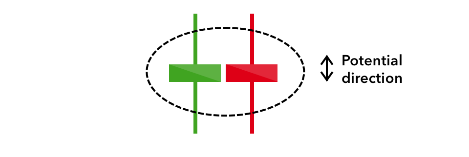
3. The Tri Star
The Tri-Star is another type of candlestick pattern that signals a reversal in the current trend. This pattern is formed when three consecutive DOJI candlesticks appear after the stock has experienced an advance in price
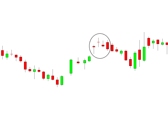
The above chart illustrates a bearish tri-star pattern at the top of the uptrend and is used to mark the beginning of a shift in momentum. A seasoned trader would be thinking, “Look out below!”
Keep in mind that even though the tri-star in this chart is clearly formed, many times there may only be 2 stars. Also note that these ‘stars’ are actually DOJI candles, signifying that neither the buyers nor the sellers have control since the stock opened and closed at virtually the same price on all three days. When you think about neither the buyers nor sellers having control and the DOJI forms at the end of an uptrend or a down-trend, then many times a change in direction is likely. In this case, three DOJIs formed. But the important thing is what had happened previously.
4.6 Real Life Application of Candle Stick Formation
Notice on the chart below how the stock has traded in a downtrend from the upper left of the chart for about 14 days from the high of around 120. (Count the candles from the beginning of the decline. Each candle represents one trading day.) The price continues each day trading lower toward the 100 area.
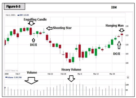
As the stock trades lower each day, what is the volume doing?
Right! It is increasing. The volume is confirming the trend. We always check the volume. If a stock is advancing and the volume is declining, then it is not confirming the trend. Notice as this stock reached the bottom and closed at the Rs.100 range on one day, then opened slightly higher the next day, and moved up to close higher that day on heavy volume. This forms the Bullish Engulfing Candle at the bottom.
What does this tell you?
The Stock Market is a ZERO SUM game. For every Seller there is a Buyer, and vice versa. This chart shows a perfect example of the ‘Bulls and the Bears’ slugging it out as the stock moved down. Selling pressure increased as shown in the volume. Support was finally found and the Bulls won. Meaning simply at the Rs.100 range, there were more buyers than there were sellers. Supply and demand at its finest, all of that information right there on a simple chart.
What else does this chart tell you?
One thing in particular is: How many warnings does a trader need? On the left side of the chart when the stock topped out at 120, there are at least three warnings that the advance was ending and a change in direction was coming. If the first Bearish Engulfing candle wasn’t enough of a warning, there was a DOJI and a Shooting Star to follow. Not to mention a candle very close to the appearance of a Hanging Man and another Spinning Top. All of those candles were within the body of the large engulfing candle
If you were thinking of trading or investing in this stock at some time in the future, you would pull up a chart on this stock and would easily see that back on this particular occasion there was ‘Support’ for this stock at the 100 range. Knowing this, you could make an informed trading or investing decision based on what the stock was selling for at the time. You would know if you purchased this stock at, let’s say, 105, then it should not fall more than 5 before it found support
You would know that if you had purchased this stock at $105 sometime in the future, and it fell through the support level of $100 then there must be a reason for this and you might want to close your position to prevent further loss. You don’t wait to see if it will trade back above support, remember: “When in doubt, get out.
Look at the highs of around 120 reached by this stock shown on the chart in the upper left area. Now look at what the stock is doing as it moves up to the right side of the chart. Look, in particular, the vertical bars get shorter just like they did on the left side when the stock moved up toward the $120 range. This tells you the ‘Trading Range’ each day is closing in, there’s less volatility, and it’s becoming more difficult to advance
What does that mean?
Supply and demand. The number of buyers and the number of sellers are becoming equal. Also note the volume. As the stock trades higher, the volume decreases. The volume is not confirming the trend. When you think ‘Trader Psychology,’ it indicates there are fewer buyers as the price advances, and that the number of buyers and sellers are becoming equal.
Additional Observations on the Same Chart
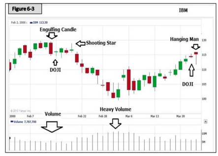
Notice the last bar on the right side of the chart. That day the stock opened and closed at practically the same price and formed a Hanging Man candle.
VERY IMPORTANT: Anytime a stock has had a significant move either up OR down over a period of several days or weeks, and you see a daily bar like that one, it indicates the stock is likely going to move in the opposite direction over the next few days. The day before was a “Spinning Top,” an early warning of a change in direction
Just as important as other points made, on the right side of the chart, the stock is once again reaching the 120 range. This is where it was on the left side of the chart when it dropped over the course of about 14 days to find support. RESISTANCE: Yes, the 120 price range is upper resistance for this stock. It could not penetrate the 120 range in February on the left side of the chart and here it is 30 days later reaching that level again.
What if you were going to trade or invest in this stock?
For instance: 1
-
If you were going to trade this stock, or even invest for the long term, why would you be buying it at the 118 to 120 range? You wouldn’t! But remember the Stock Market is a zero sum game. Someone bought that stock at 120, and someone sold it!
-
Who are the likely ‘Sellers’ at the 120 range and who are the likely ‘Buyers’ at the 120 range? The Pros are the ones that were buying it at the support level around 100 and those buyers are now the Sellers at 120. The buyers at 120 are obviously inexperienced and uninformed and have no training on chart analysis. They are jumping in hoping the stock will continue to advance.
One more thing about the volume:
When the stock sold off for 14 days and then found support. The volume increased. Now think trading psychology again. The buyers up at the 120 range are obviously giving up, afraid of further loses, and the Pros have been sitting idly by waiting for the stock to reach support. When support is reached, they step in.
So you have the informed buyers moving back in to the stock and the uninformed sellers throwing in the towel at the same time, thus, the increased volume, and no further decline. This is also a good lesson in patience. A new investor or trader usually lacks patience and has the tendency to want to jump in, fearful of missing out on an advance. Don’t make that mistake. Wait for the confirmation. Buy at the bottom, not at the top. And, always use a Stop Loss to protect your capital.

