- Study
- Slides
- Videos
3.1 Introduction to Line Chart
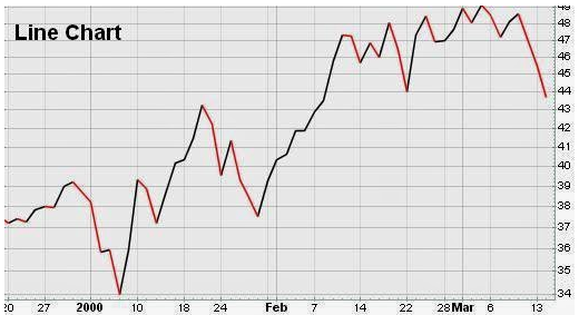
Line charts are the simplest form of charts depicting price changes over an interval of time. Usually, only the closing price is graphed, depicted by a single point. The series of these points constitutes a line — hence, the name. However, intraday price changes can also be plotted, either by plotting each trade, or by selecting the last price of a given interval, such as an hour or 15 minutes. Because line graphs are simple, it is easier to compare the prices of multiple securities or indexes on the same graph.
In short,
- A line chart is a type of chart that displays information as a series of data points connected by straight line segments.
- A line chart is a way of visually representing an asset’s price history using a single, continuous line.
- A line chart is easy to understand and simple in form, typically depicting only changes in an asset’s closing price over time.
- Because line charts usually only show closing prices, they reduce noise from less critical times in the trading day, such as the open, high, and low prices.
- Because of its simplicity, however, traders looking to identify patterns or trends may opt for chart types with more information, such as a candlestick.
Line chart of Nifty

3.2 Usage of Line Chart
-
-
Line charts are ideal for beginner traders to use due to their simplicity. They help to teach basic chart reading skills before learning more advanced techniques, such as reading Japanese candlestick patterns or learning the basics of point and figure charts. Volume and moving averages can easily be applied to a line chart as traders continue their learning journey.
-
Additionally line charts may not provide enough price information for some traders to monitor their trading strategies. Some strategies require prices derived from the open, high, and low. For example, a trader may buy a stock if it closes above the high price of the previous 20 days.
-
Also, traders who use more information than just the closing price do not have enough information to back-test their trading strategy by using a simple line chart.
-
3.3 Introduction To Bar Charts
One of the basic tools of technical analysis is the bar chart, where the open, close, high, and low prices of stocks or other financial instruments are embedded in bars, plotted as a series of prices over a specific time period. Bar charts are often called OHLC charts (open-high-low-close charts) to distinguish these charts from more traditional bar charts used to depict other types of data. Bar charts allows traders to see patterns more easily.
A bar chart, shows the price of a stock and its volume (number of shares traded) over a period of time, usually measured in days, weeks, or months. A daily bar chart, for example, would show the highest, lowest, and closing prices each day, as well as the number of shares traded daily. Similarly, a weekly bar chart would show the highest and lowest prices for the entire week and the total volume of the entire week
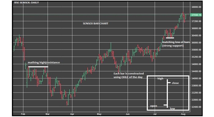
Bar chart of Sensex (daily)

As you can see, Sensex was trading in the range of 32400 to 38000. It can be seen, over this period of time, the primary trend was up.
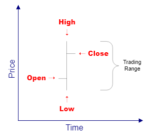
Note that each day in the above chart is indicated by a separate ‘bar.’ Each bar has a little ‘tick’ on the left side indicating the opening price that day, and the little ‘tick’ on the right side of the bar indicated the closing price for that day. The length of the bar tells us the trading range for that particular day, as noted by the arrows on the above chart. Here is a closer look at how the daily bars on a chart indicate the opening price, the closing price, and the trading range for the day

Also remember that whether one is looking at a daily, hourly, or even a weekly chart, the trends and pattern formations will tell pretty much the same thing in relation to the chart you are viewing. Meaning, if one is looking at a daily chart, then the general trend should be viewed as a daily basis. In other words, do not make decisions for long-term investments based on what you see on a 5- minute chart or an hourly chart. And don’t make day-trading decisions based solely on a one year chart.
For instance: A 3-month chart shows the daily bars for each trading day represented on that chart. And, a chart of one single trading day will show 1-minute, 5-minute, or possibly 10-minute bars. But each bar represents its open, close, and the trading range for its respective time period.
3.4 Different Types of Bar Charts
There are basically four combinations of bar charts which includes-
-
Up day- If the high and low of the present bar is higher than the previous bar and it is known as up bar or up day.
-
Down day– If the high and low of the present bar is lower than the previous bar, it is termed as down bar or down day.
-
Inside day- If the high of the present bar is lower than previous bar high and the low of the present bar is higher than the low of the previous bar, then the present bar is termed as an ‘inside day’.
-
Outside day- If the high of the present bar is higher than the previous bar while the low of the present bar is lower than the previous bar, it is known as outside bar.
3.5 Bar Patterns
Bar chart analysis is more useful when the bars over a time period are viewed, allowing patterns to be discerned that may forecast future prices with varying degrees of success. The simplest comparison is between 2 consecutive bars. An up-day is when the close is higher than the day before. A down-day is when the close is lower. The closing price is generally considered the most important price, because traders have reacted to the news for the day. But sometimes the close is down, not because of negative news, but because many traders sell on close to avoid any price declines due to bad news overnight.
Higher closes generally implies a bullish market sentiment whereas lower closes indicates bearish market sentiment. An uptrend is a series of up-days where the highs are mostly higher than the day before and the lows are also higher. Both the higher lows and the higher closes (up-day) confirm the uptrend. A downtrend is the opposite pattern, where highs, lows, and closes are usually lower on successive down-days.

